Visual brand identity
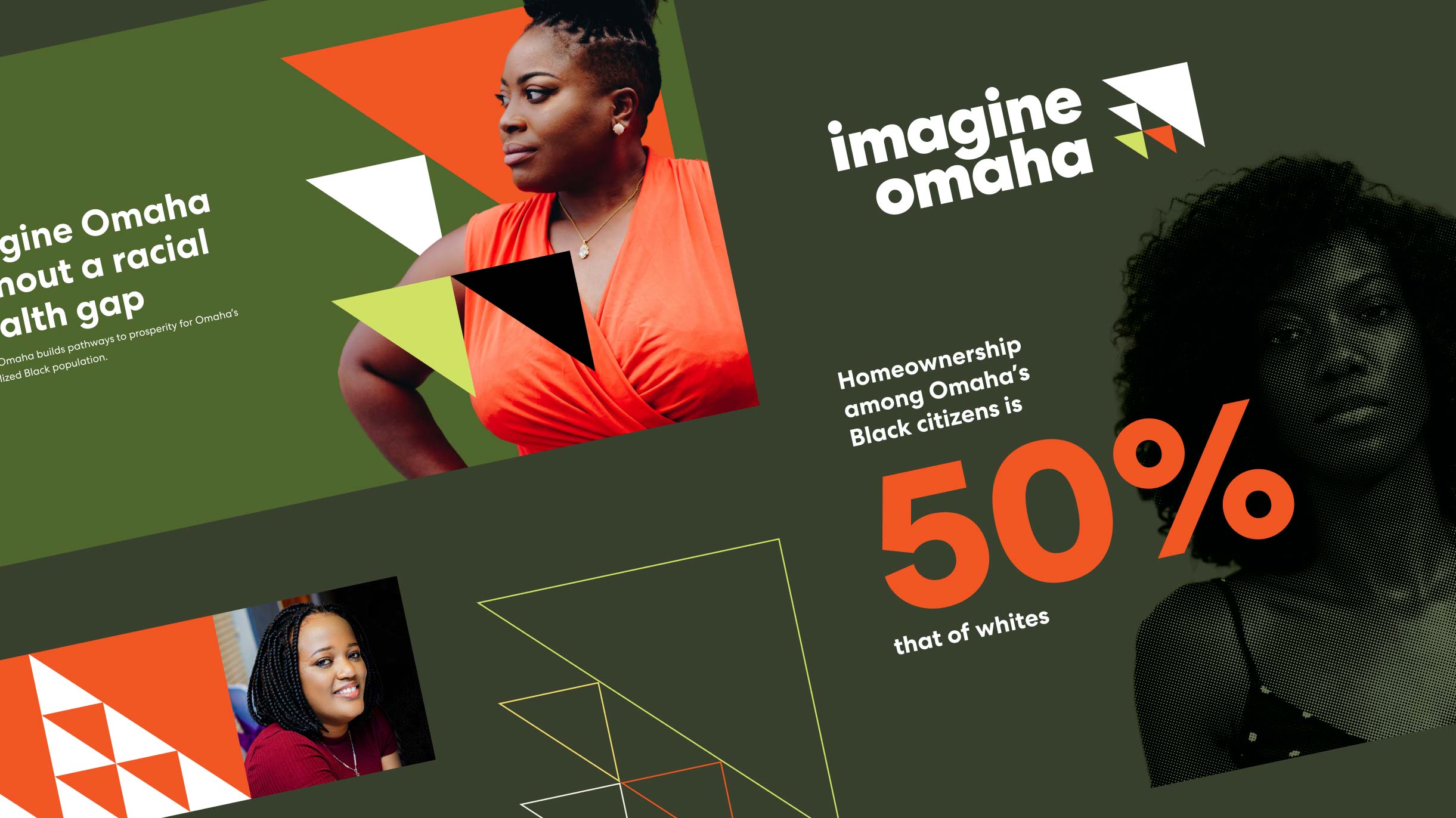
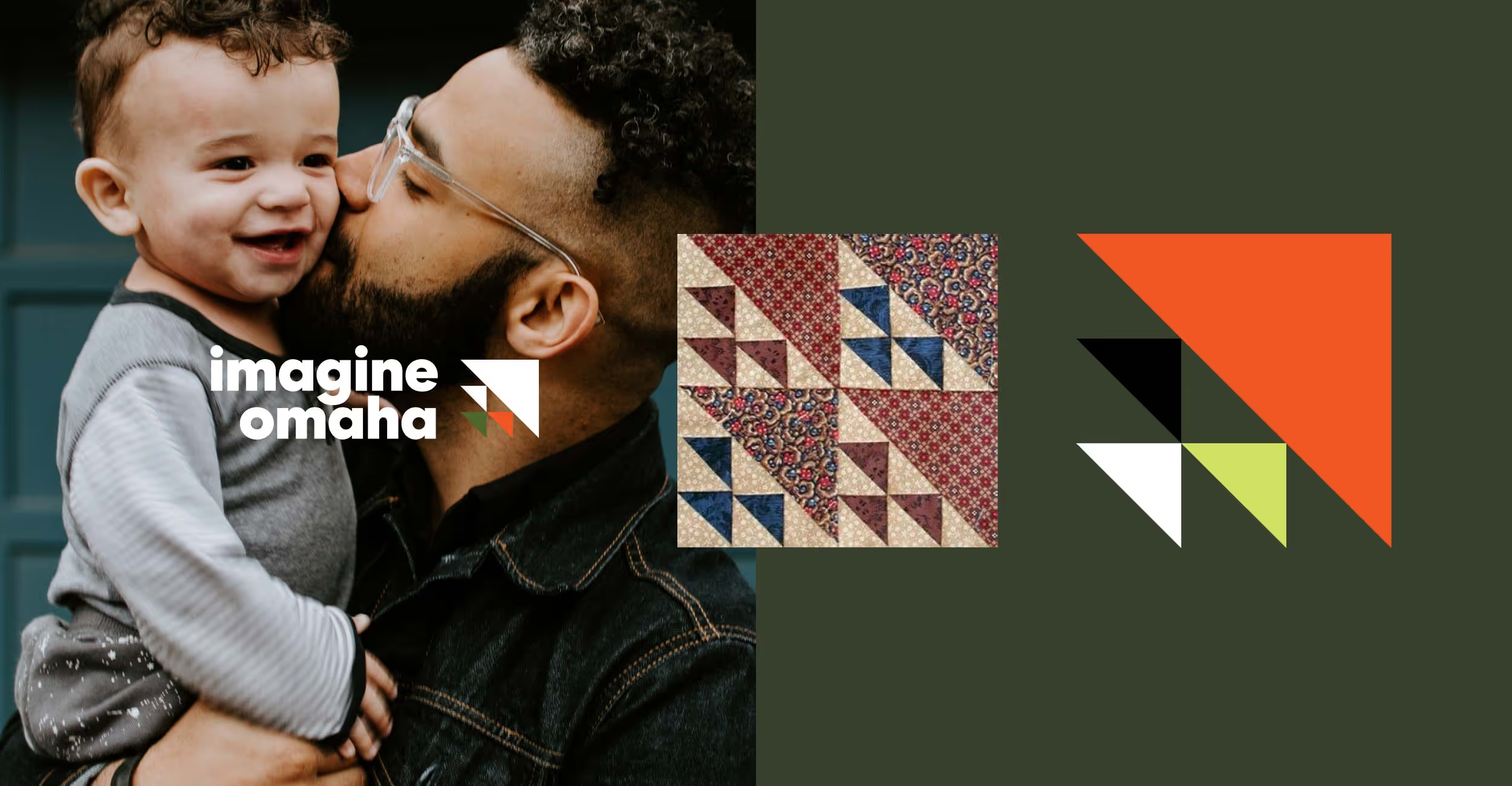
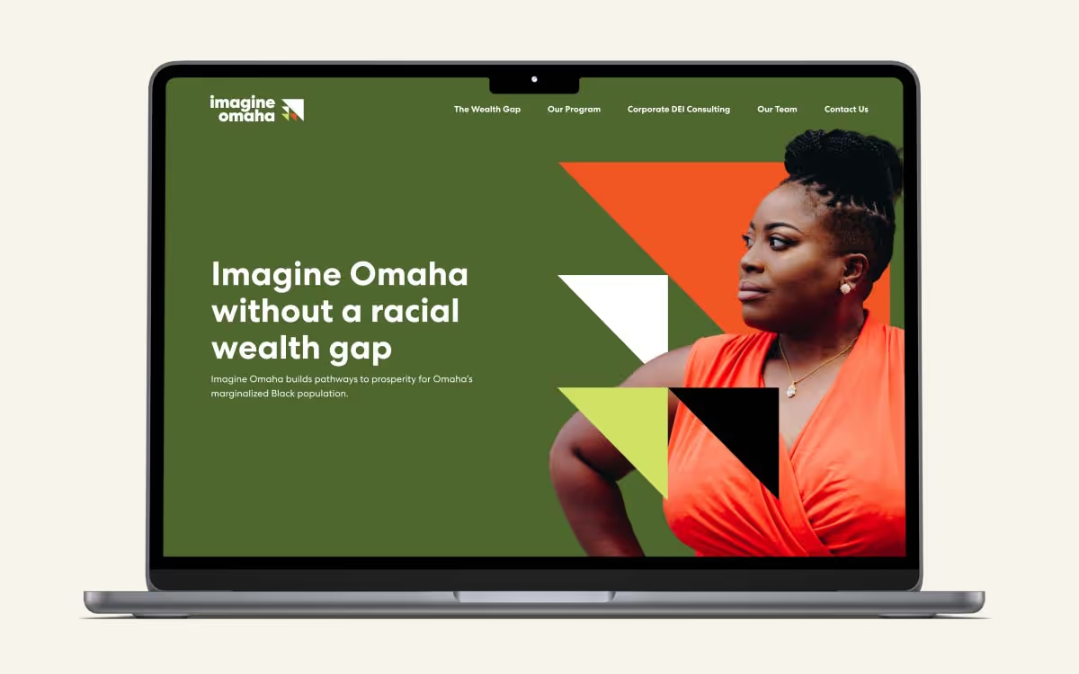
Embarking on the creation of Imagine Omaha’s visual brand identity, our inspiration was drawn from diverse and meaningful sources that hold significant cultural resonance. The starting point was their logo, which is a modern interpretation of the “Birds in the Air” quilt pattern. This design was chosen for its historical significance: traditionally used as a secret language among African slaves to communicate escape routes and other vital information. In this context, it encapsulates the spirit of a journey towards freedom and prosperity.
Our chosen color palette subtly echoes the hues of the pan-African flag, a symbolic nod to the heritage and history of the Black community. These colors serve as a constant reminder of the resilience, courage, and determination that form the backbone of Imagine Omaha's mission.
Typography and graphic elements
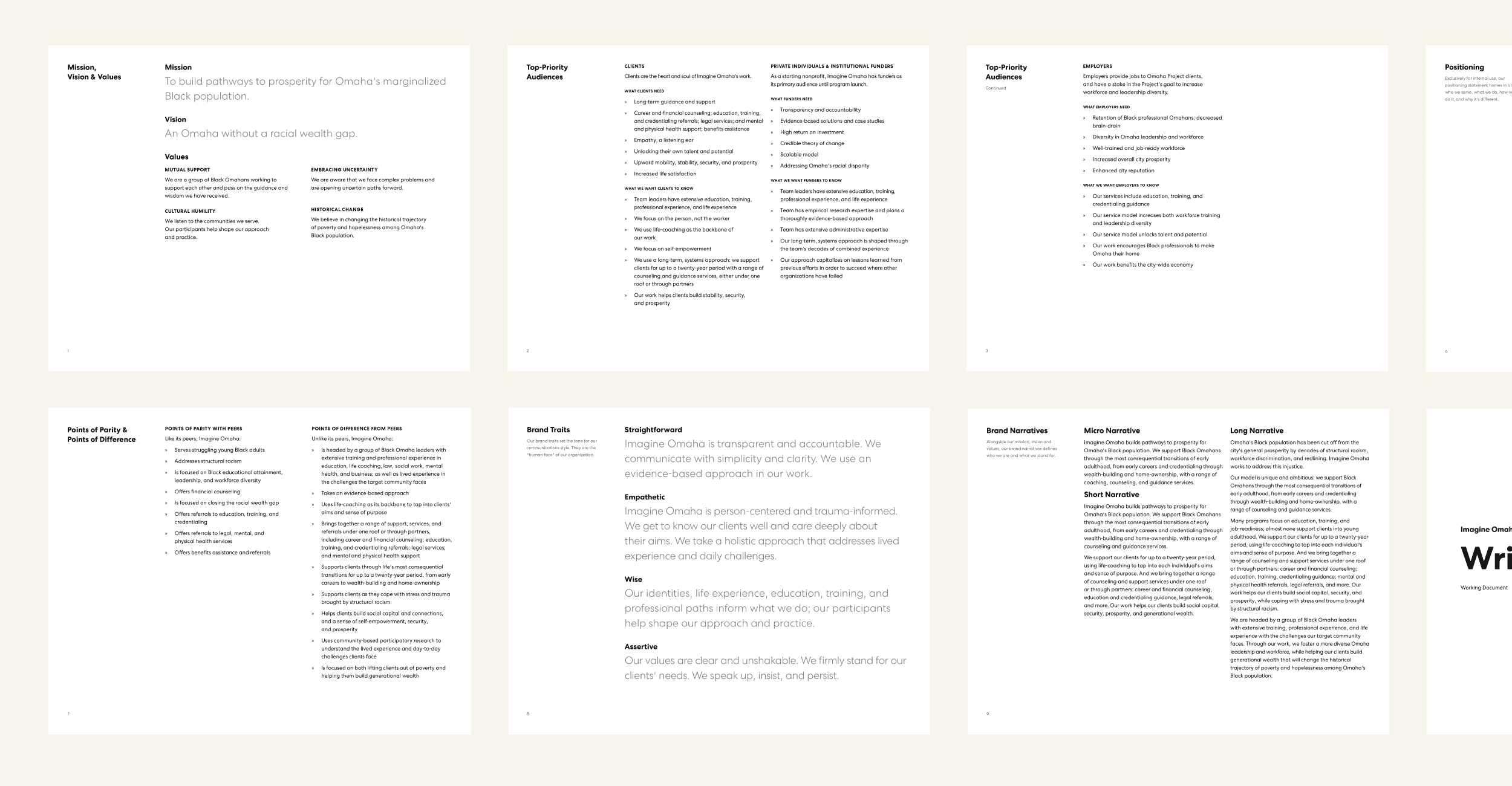
For typography, we selected the Centra No.2 font from Sharp Type. This geometric sans-serif typeface possesses an inherent balance, combining influences from modernist typefaces of the twentieth century with a keen focus on texture and readability. It adds a layer of sophistication and modernity to the brand, ensuring legibility across all platforms while maintaining a distinct style.
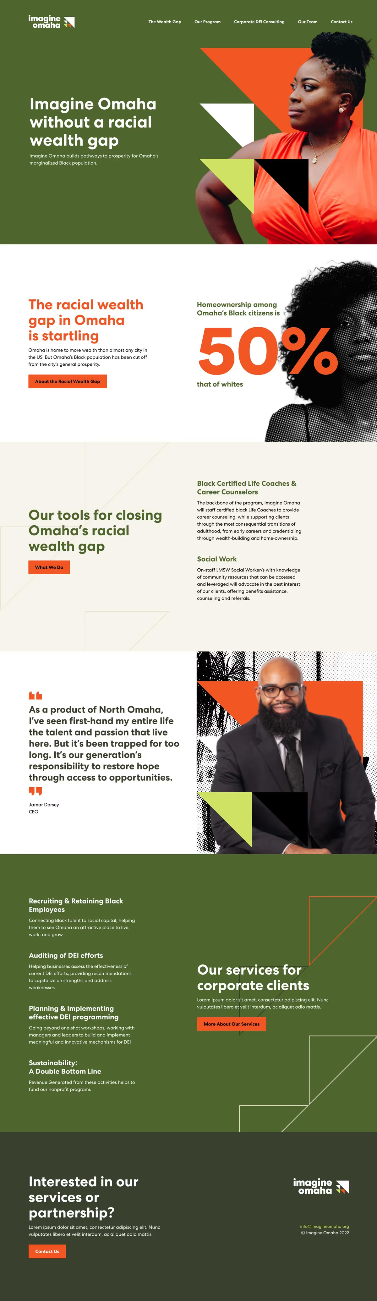
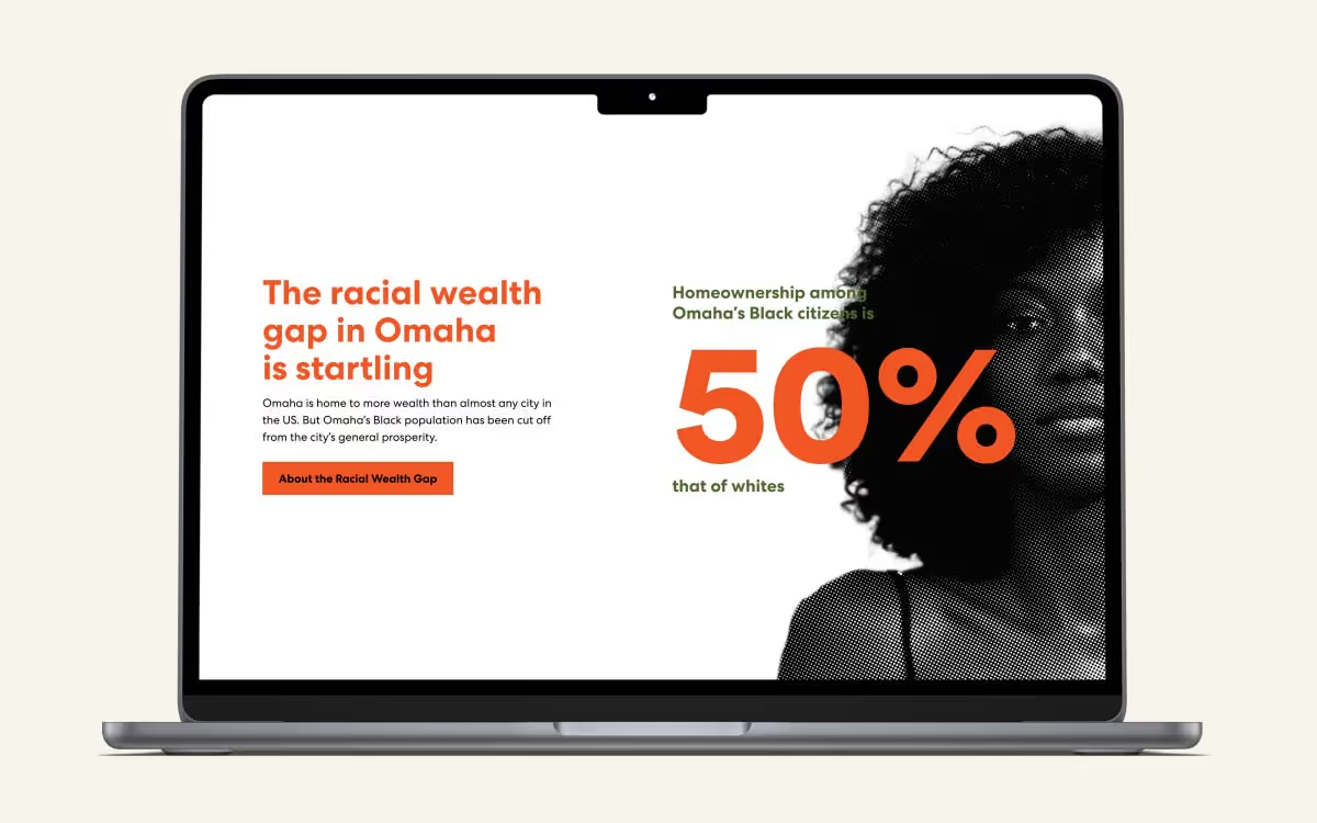
The visual identity is further enriched by supporting graphic elements. The use of halftones lends a dynamic visual texture and depth, while the artful use of silhouetting introduces an element of storytelling and individuality. The integration of the logo into images further enhances the brand’s visual language, creating a multi-faceted identity that is as distinct as it is memorable.